Showing posts with label moral realignment challenge. Show all posts

Monday, April 23, 2007

Moral Realignment Challnge: Starfire and Psimon

In the Moral Realignment Challenge, I imagine how a bad guy would look as a good guy, and vice-versa. Currently I'm working my way through the Fearsome Five and the Teen Titans! Hey, Starfire and Psimon! You're up to bat!

psimonyoursidestarfirevil

From "Quiz the Question Guy (All-Psimon Edition)" in "Direct Currents" on the back pages of "Brainiac Bunch" #218 (February 1982) on Earth-AAA:

Q: Where did Psimon get his powers? A: Orphan Simon Jones was granted his magic mental abilities by the old wizard Trigon the Terrific!

Q: Why does Psimon wear that dome on his head and what is it made of (the dome, not his head)? A: Now that he's a grown man, only Psimon's special diamond quartz helmet can keep his awesome powers in check when he's outside of his containment capsule.

Q: What happened to the Psimon back-up in CLAIRVOYANT COMICS? A: Psimon is busy adventuring with his pals in THE NEW FEARLESS FIVE. But don't be surprised if he guest-stars later this year in CLAIRVOYANT fighting alongside his former mentor, Doctor Psychic!

Q: Why does Starfire have it in for Psimon? A: In DC SUPERSTARS IN SPACE #6 he prevented her from destroying her home planet of Tamaran.

Q: Is Psimon related to Validus from the LEGION OF THE SUPER-VALIANT comic? They both have mental powers, Psimon wears purple and has a see-through helmet and Validus is purple-skinned and has a see-through head! A: Wow! Interesting theory, but nope! Validus is not Psimon's descendant. Besides, can you imagine your child coming out looking like your favorite outfit? That would just be silly!

psimonyourside

Evil Psimon is a creepy monster so I made Good Psimon a handsome hunk. He has that Mister Freeze thing goin' on with the helmet so the fact he's a dreamboat just makes it all the more tragic he can't kiss anybody. (And conceptually, Good Psimon owes a lot to Cyclops, Rogue, Jack of Hearts, and just for the heck of it, Captain Marvel... er, the Fawcett/DC one.) I based Good Psimon's costume on the Evil Psimon's original duds... y'know, the hot pink choir robe with the lace collar? That's where the cape came from. So the terrarium helmet wouldn't get lonesome, I added see-through-plastic-over-white gloves and kneepads. The rest of the costume is done up in shades of purple to coordinate with the cape. Finally, his hair is white, because it goes with the whole colorless/see-through head theme. Besides, I just can't resist a good-lookin' guy with prematurely white hair!

starfirevil

Good Starfire's costume is a flimsy purple number with freakin' daisies or some shit on it, so I made Evil Starfire's costume the opposite of that in several ways:
  1. It covers everything except her face and hands.
  2. The color is hot instead of cool.
  3. The shapes are geometric instead of organic. Specifically, that goofball flower thing has been replaced by hexagons.
Also, her positively gargantuan Tamarafro of sproingy, curly hair -- or rather, the energy that surrounds it and creates the illusion of a trail as she passes by, is confined to a crest of flames atop the helmet. Voila! Curvy cosmic badass!

Next week: I'm not done with Starfire yet! It's Gender Reassignment Challenge time!

Previous Moral Realignment Challenges:

Monday, March 19, 2007

Moral Realignment Challenge: Wonder Girl and Mammoth

The Moral Realignment Challenge has me imagining how good characters might look if they were evil and vice-versa. Right now I'm working with the Teen Titans and the Fearful Five. This time around it's Wonder Girl's and Mammoth's turns.

So here's another glimpse into the topsy-turvy world of Earth-AAA, where the valiant Fearless Five is locked in a never-ending struggle against the perfidious Teen Tyrants!


From previews of DC comics shipping November 8, 2005, on the "Newsapalooza" website:

The Wonder Girl Loves Mammoth Sadie Hawkins Day Special #1

Written by Bob Kane, Bob Haney, Marv Wolfman, Mike Barr and John Ostrnader.
Art by Dick Sprang, Win Mortimer, Nick Cardy, George Perez, Romeo Tanghal and Jim Aparo, Luke McDonnell and Karl Kesel.
Cover by John Romita Sr.

From the DC archives comes this collection of stories featuring everyone's favorite Fiver and the Tyrant who loves him! Features their first meeting in the now-classic "The Amazon Outlaws of Paradise Ranch!" from Blockbuster #97 (1956). Plus many important turning points in their lengthy (if one-sided) relationship, including "The Day Mammoth Betrayed Blockbuster" from Explosive Comics #325 (1964), "The Way-Out Wedding Crimes of Wonder Girl" from Fearless Five #16 (1968), the two-part "Love Hunt" from New Fearless Five #37 and Blockbuster & the Insiders #5 (1983) and "Tender Trap" from Homicide Squad #32 (1989).

On sale November 8 * 120 pg, FC, $7.99 US

Good Mammoth looks younger and handsomer than his villainous counterpart. An elephantine gray replaces the black in his color scheme, and the vaguely S&M straps and studs are gone. After all, what right-minded individual would put a superhero in a gimp suit, Mister Bendis? I designed a stylized "M" symbol for him that looks like a mammoth's head, and put tusk-like curlicues on his mask. His great shock of strawberry blonde hair is meant to evoke the fur atop a mammoth's head, and I think it just begs to be tousled. The long gray boots and gloves are remeniscent of an elephant's legs. He's relatively hairless because that's just how it was done in those days. And yes, good Mammoth is indeed the kid sidekick to a good version of the old Batman villain, Blockbuster. Also? Mammoth and Wonder Girl = Moose and Big Ethel from Archie Comics.

I gave Evil Wonder Girl a cowgirl theme for a couple of reasons. For one, I wanted to avoid the Greek-armored, militaristic bad-ass cliche. For another, I just thought it would be fun. And finally, the lasso suggested it. Since she's bad, I replaced the white-starred blue in her original costume with plain old black. And her "W" symbol is meant to suggest a cattle brand. Not that I pulled it off at all, but I tried to make the evil Wonder Girl beefier than the good one -- not because sturdier, curvier gals are evil, but because I thought it would make her a better physical counterpart for the cartoonishly muscular Mammoth (and all his oversized... appendages.)

Monday, February 26, 2007

Moral Realignment Challenge: Nightwing and Gizmo

In the moral realignment challenge, I imagine how a hero would dress if he were a villain, and vice-versa. Way, way back on July 10th, Big Head Boy suggested I morally realign the Teen Titans and the Fearsome Five, "80s STYLE!!!" It took me over seven months, but I'm finally ready to meet him halfway! How's that for commitment? I'll do entries for every member of the Fearsome Five -- which is way more than five, by the way -- and an equal number of opposing Titans. I just would rather not do them in a 1980's style -- and especially not like the 80's era George Perez. I mean, the man is a storytelling genius and a true craftsman, but back in the 80's his costume designs were a bit... much.

So, here's an index entry from the "Fearless Fortress" website on Earth-AAA:

goodgizmo


Best of DC (Gold Star Digest) #18 [1981]: This DC Digest contained mostly reprints of Fearless Five comics from the 60's and 70's. It also offered a full-length Gizmo solo story called "Breakup!" Written by Marv Wolfman with art by Carmine Infantino. Gizmo's romantic troubles continue as his on-again, off-again girlfriend Komand'r dumps him for Dick Grayson, a dashing aerialist. Meanwhile, Gizmo is frustrated by his inability to stop Nightwing, an owlish burlgar, from pulling off a series of highrise art thefts. Gizmo finally learns more than he bargained for about the criminal. Not only is Nightwing in reality Dick Grayson, but Dick Grayson is Gizmo's old nemesis from the Teen Tyrants: the Robin. First appearance of the Robin as Nightwing. Origin of the Robin/Nightwing. Reprinted stories: "The Fearless Five!" from "The Good & the Gallant" #54 [1964] by Bob Haney and Bruno Premiani [the team's debut], "A Royal Pain" from "Fearless Five" #17 [1968] by Bob Haney, and Nick Cardy [second appearance of the Reasonable Rocker], "Men Call Her... Eve!" from "Fearless Five" #25 (1970) by Bob Haney, Gil Kane, and Nick Cardy [first appearances of Eve Cloud and Mister Zeus], and "Wrongs Over Europe" from "Fearless Five" #46 [1977] by Bob Rozakis, Irv Novick, and Joe Giella [second appearance of the Flops, first appearance of Batman's Daughter].

...Yes, the "evil" version of Nightwing looks kind of like Batman. I already knew I wanted to go with an owl theme for him, and it worked out nicely that the horned owl's silhouette was similar to a bat's. The hard part for me was devising something that didn't look exactly like Batman's costume, and didn't look too much like Owlman's or even Nighthawk's. It probably looks most like Nightowl (from "Watchmen"). I covered the entirety of Nightwing's face to make him more menacing and ninja-like. The feather-like appendages on the sleeves are an homage to Batman's stylized gloves, but I ran Nightwing's all the way up the arms. This is partly in lieu of a cape. I've done bird-themed costumes with capes before, and I didn't want to repeat myself. Plus, I liked the way this costume looked without one.

Gizmo has traditionally been very covered up -- even his head didn't have much flesh exposed, what with the hood and the goggles and the big bushy beard. (His "Outsiders" appearances, with the goofball fu-manchu and braided goatee and the shaved head was not an improvement.) The Bizarro version of Gizmo had to be more accessible for a young audience, so I made him look more youthful. I kept the beard but I lightened it and trimmed it quite a bit. I figured he still needed goggles, but I swapped out his old ones for a style that exposes his eyes. And I adorned his formerly bald pate with a thick mop of hair. I also got rid of the character's pot belly -- which I only noticed in the recent version with the switch from a baggy jumpsuit to skintight Lycra. Honestly, Gizmo, do you know nothing about hiding your figure flaws? (If I had my 'druthers, I'd put Colossal Boy in a tasteful kurta and some genie pants. You heard me, Gim -- if I want to see a flabby man in a cowboy costume, I'll travel back to 21st-century Wichita, a-thank you very much.)

Friday, July 14, 2006

Moral Realignment Challenge: Green Arrow And Clock King

Jeremy finally consented to let me have my own Flikr account, so everything's a go!

realclockking

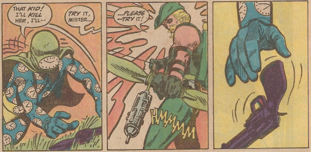
Look out! Green Arrow's got a Mulling It Over arrow! Hmmmm...

Maybe that joke was lame, but it's not nearly as lame as Clock King's costume. He's dressed for scuba diving, for Chrissake! There's nothing intimidating about him at all, other than the fact you can't see his face, and the notion that he's so batshit crazy that he thought that costume was a good idea. Does he need a costume redesign? But of course. But he's a bad guy, so I could only live with myself if I did it hypothetically. Unlike my other costume designs, which 
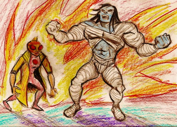
really happened. So let's put him and that dirty hippie Green Arrow in the Moral Realignment Challenge! That's the one where I switch the roles of a hero and a villain and imagine how they might have appeared in the world of comics.

Let's go!

Excerpted from the essay "Changing Times: Clock King In The 60's" from "Alter Ego" #38 (2004) published on Earth-P:

silverageclockking

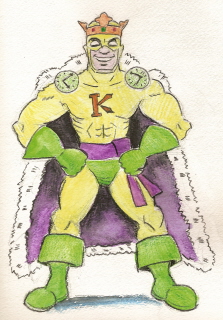
"...and most notably, bringing in leggy France Nguyen to replace Barbara Eden in the role of the Black Canary. But even these tweaks couldn't increase the show's popularity with a viewing public that had grown tired of camp -- and only halfway through its fourth season, the 'Clock King' television program was canceled.

The Mechanically-Minded Marvel continued to enjoy success in his original medium of comics. By 1968, Clock King was featured in five monthly DC publications. In addition to 'Clock King' and 'Inventive Comics', he was a member in good standing of 'The Six Scouts Of Triumph' and enjoyed team-ups with Calendar Man in 'All-Time Finest Comics' and with a rotating slate of guest-stars in a former Western title, 'The Big Hand And The Little Hand.'

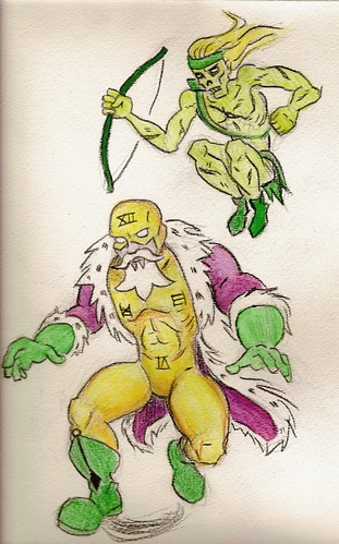
Still, the swift demise of Clock King's TV show weighed heavily on the minds of DC staffers. For years, they had intentionally mimicked the program's light, comedic tone in their comics. Now, they worried that the comic book audience was going to turn on the character just as the television audience had done. In a weekend-long brainstorming session, plans were laid out to dramatically overhaul the character. Familiar gimmicks such as his boxing glove cuckoo clock and his sundial hover-discs were scrapped. Stories would return Clock King to his pulp-era roots, placing a much stronger emphasis on his detective skills, and reestablishing his personality as a curmudgeonly genius with an obsession for order and logic.* To signal Clock King's new direction, he was given a visual makeover courtesy of superstar artist Neal Adams. Adams discarded many of the lingering Golden Age elements of the costume, including the trunks, the enormous sash, the large 'K' on his chest, and even his crown! Clock King's new look featured Roman numerals, sleeker boots and gloves, a new cape inspired by the Elizabethan era, and -- quite startling for the time -- a fanciful, three-pronged beard. The beard, while undoubtedly quite regal, was also a blatant marketing ploy by DC to appeal to the college-age market. Although the letter columns were beset by angry fans demanding to know how Clock King could wear such distinctive facial hair in both his superheroic and civilian identities without anyone noticing, DC's editors refused to address the issue. Within a year, most readers seemed to have accepted the situation, perhaps chalking it up to 'the magic of comics.'

newlookclockking

DC launched Clock King in his 'Startling New Direction' (as the cover blurbs on his comics phrased it) with 'Inventive Comics' #381 (October, 1968). The classic story pitted him against one of the most lurid foes of the hero's early days.

The Green Arrow was a ghastly, violent figure, and had appeared in comics only once before. As told in "Inventive Comics" #30 (August, 1939), the Green Arrow was originally a mortal man named Oliver Queen. Queen, a dashing but arrogant sportsman, knowingly trespassed on a sacred Native American burial ground while bow-hunting and was cursed by a 'savage witch-doctor.' The archer was struck dead on the spot, only to be resurrected as a zombie-like killing machine who would systematically murder nearly every member of his family. The gruesome tale concluded with Clock King crushing the monster within the workings of a printing press.

The 1968 story, with a script by Bob Haney and artwork by Adams, reintroduced Oliver Queen as a corrupt millionaire who had dropped dead of a heart attack while lobbying to dump chemical waste in a reservation. Reanimated by his own bigotry, the new version of Green Arrow embarked on a killing spree of every Native American who had ever opposed his business interests, framing a handsome young activist for the crimes. Clock King cleared the man's name, punched a rabid coyote in the face, crushed the Green Arrow's living corpse beneath a totem pole, delivered a stirring speech on tolerance and jumped over a gorge in a souped-up dune buggy.

*The quirkier, more fairy-tale aspect of Clock King would not be seen again until 2002, when his two surviving comics were helmed by Grant Morrison and Neal Gaiman.

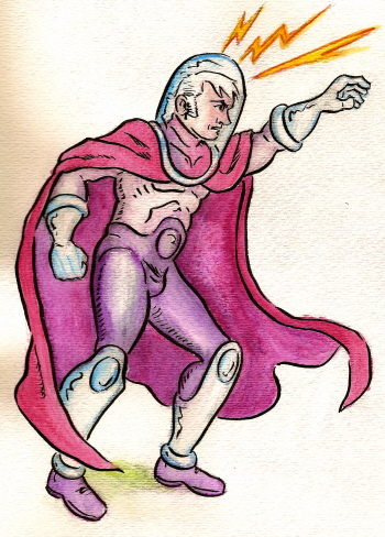
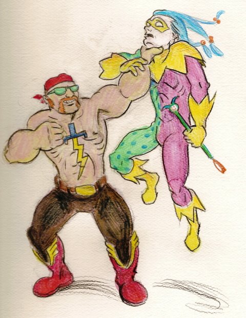
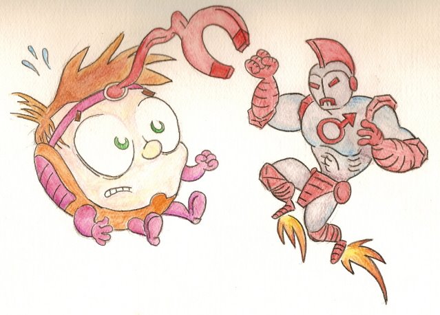
...Yes, my Clock King redesign is very "Royal Flush Gang" but I can't help it; I just love their look so much! The same goes for Jack Of Hearts. I originally was going to put clock hands on his chest but it looked too busy. And the beard, for me, was the icing on the cake. Green Arrow's beard comes to two points? Clock King's comes to three! Take that, hippie! As for Green Arrow himself, I thought about going the right-wing paramilitary route with him or making him a Manson-type hippie cult leader. But I didn't want to make him look too similar to Evil Flash. And then I hit on the Solomon Grundy riff and everything clicked. The Silver Age costume for Clock King, by the way? I don't honestly think it looks good. (Trunks over tights? *shudder*) I just wanted to show what he might have looked like as an old-fashioned hero.

Monday, July 10, 2006

Moral Realignment Challenge: The Flash And Murmur

How might Wally "The Flash" West look if he was a villain? And how might Murmur look if he was a hero? Let's see!


Excerpt from "DC Nation" in the back of all DC comics with a cover date of August 2006, on Earth-Bajillion:

"With the Trickster's heroic sacrifice in the pages of CRITICAL INFINITY, his legacy is in the hands of his mute former sidekick, MURMUR. But the grim, daring acrobat is about to find out that for every legacy hero, there's a legacy villain! And there's none deadlier than the new Flash! Bigger -- and faster -- than his late namesake, this Flash is a brutal drug lord who's determined to rule Peripheral City. Is Murmur agile enough to defeat the fastest thug alive? Or will he end up as a stain on Flash's boots? Geoff Johns and Cully Hamner provide the answer in the pages of MURMUR.

...Fun fact: I almost gave Evil Flash a beer belly. Thank God I came to my senses.

I already knew I wanted to make Good Murmur a motley-clad hero, because Evil Murmur wears a jester outfit already (only it's black leather bondage *yawn* gear). I got rid of the stupid facemask because I've always freaking hated it. It just bugs the shit out of me. Simple as that. So instead I carried the clown motif through with a pale face and with dyed hair that is arranged to looks a bit like a jester's cap -- not completely, since I didn't want him to look like Sideshow Bob, but enough to convey the idea. When he's still, it would be lank and a few locks would hang over his face. I also figure that as part of his gimmick, Murmur would have a morose demeanor and never smile. Which makes total sense since he's a Geoff Johns character, and therefore has nothing to smile about.

I designed Evil Flash to be a stark visual contrast with Good Murmur. Good Murmur wears a costume, so Evil Flash wears street clothes. Good Murmur is kinda slim, so Evil Flash is brawny. And (although you can't really see it here) Good Murmur never smiles, so Evil Flash always smiles. Which is kinda creepy.

And again, no, that's not me as "Evil Flash."

Questions? Comments?

Wednesday, July 05, 2006

Moral Realignment Challenge: M.O.D.O.K. And Iron Man

More art! As most of you know, with the moral realignment challenge, I try to figure out how a superhero and a supervillain might appear in the comics with their morality reversed. An anonymous commenter once suggested "Iron Man & M.O.D.O.K. -- and if you can do that one, you're a genius." In a stroke of great fortune for us all, it just so happens I am a genius! (And a modest one at that!) Behold!


From the Earth 73.69-B-XVII version of "Marvel Age" #42 (September, 1986):

BIG-HEAD BOY #14 -- The Big-Head Boy, M.O.D.O.K. (Mentally Overdeveloped Designer Organic Kid) is back in his own dimension after his titanic team-up with Harry Osbird, The Green Gobbler. Then why can't anyone at Advanced Idea Middle School remember who he is? There's a new hero in town -- and it's none other than Earth's vilest villain, the insidious Iron Man! The cad has swiped Victor Von Dream's Time Tumbler, and he's using it to superimpose himself into all of Big-Head Boy's past triumphs! Can Big-Head Boy uncover the shocking secret behind Iron Man's demented plan? And can he fix the timestream before he disappears altogether? "Adventures: Disassembled" is written by Stan Kaye, penciled by Howie Post, and inked by Jon D'Agostino. A Star comic. $0.65.

...My first thought was, how could M.O.D.O.K. be appealing enough to headline his own comic? And my second thought was, "If he was adorable." To me, that meant de-aging him and putting him in a comic specifically targeted to children. It followed, then, that the evil version of Iron Man would look like someone out of a Jonny Quest episode. So I made his armor look more old-timey, with a Romanesque fin on the head and a segmented iron loincloth. The joints at the elbows and shoulders are meant to resemble hexagonal nuts. The mouth slit turns down so it's a permanent frown, and of course both the mouth and the eyes glow. The design on his chest is one of the alchemical symbols for iron, and naturally it's also the symbol of the male gender, which was serendipitous. And I made the color scheme red-and-gray, like magnets and old robot toys.

So, what do you think?

Monday, July 03, 2006

The Hell--?! Artwork?!! (Moral Realignment Challenge: Apocalypse And Jubilee)


From Marvel Comics solicitations for October 2005 (on Earth-427B):

BEST OF ESSENTIAL APOCALYPSE VOL. 1 TPB
Written by STAN LEE, ROY THOMAS, JIM SHOOTER, DAVID ANTHONY KRAFT, BILL MANTLO & WARREN ELLIS.
Cover and pencils/inks by JACK KIRBY/GEORGE ROUSSOUS, ROSS ANDRU/FRANK GIACOIA, P. CRAIG RUSSELL, SAL BUSCEMA/JOE SINNOTT, ERNIE CHUA, BOB HALL/DAN GREEN & LEONARDO MANCO.
Just in time or Halloween, it's a collection of the first and best appearances of everyone's favorite gray goliath, Apocalypse! Includes his debut in 1960's "I Awoke The Mega-Mummy!" from "Journey Into Fantasy" #45, his reappearance as one of the Defenders in 1971's "Marvel Main Attraction" #1 (also featuring Doctor Mordo, Attuma The Aqua-Warrior, and Planet-Eater Lad), his first battle against the psychotic super-powered delinquent Jubilee in the pages of "Red, White & Blue Skull" #183 (1975), the groundbreaking story in which Apocalpyse saves a young man from a gay bashing and also comes to terms with his own homosexuality in "Rampage Of Apocalpyse" #7 (1977), Jubilee's terrifying transformation into the Kree-powered menace "Firestone" in "Awesome Apocalpyse" #54-55 (1978), Apocalpyse's titanic tussle with a fellow hero in "Bullseye: The Man Who Never Misses" #159 (1980), and his triumphant return from Comics Limbo in the mature-readers-only "Apocalpyse: Prince Of Death" #1 (1995).
180 PGS./B&W/MARVEL PSR...$9.99
UPS: 7200411582-00111

Boy, I really need to get that Illustrator program, don't I? I can't seem to get the hang of Jeremy's colored pencils at all. (I lost my pastels; so sue me.)

Annnyhow, here's my interpretation of Steven's idea of realigning Jubilee and Apocalypse. I did some reading-up on Apocalpyse and found out he was an ancient mutant who swiped some Eternals technology for his body-suit. So I figured if he was a good guy, he wouldn't have the suit. Ergo: Mega-Mummy! Good Apocalpyse is strong like the Hulk and has regenerative capabilities. Bad Jubilee is a mutant street-urchin who uses her powers to start fires and kill people, and to make her more of a match for Apocalypse, I juiced her up a la Moonstone. I ended up redrawing her a bunch of times and I'm still not happy with her but to be honest I'm also not that interested in her. What I was most into for this assignment was imagining Good Apocalpyse's publishing history as a cross between a Marvel Monster and the Hulk.

I'll try for more artwork posts this week.

Monday, April 24, 2006

Moral Realignment Challenge: The Elongated Man And Doctor Light

good doctor light

The above image and the following "next issue" blurb can be found on the letters page of "Doctor Light" #128 (April, 1981) which was published on Earth 3.1:

NEXT MONTH: Why is DOCTOR LIGHT'S glamorous girlfriend, SUE DEARBON: GIRL P.I. being shadowed by that gruesome sideshow performer-turned-criminal, the eerie ELONGATED MAN? The Knight of Light and the Socialite Sleuth have only 24 hours to find the answer, and their only clue is... a horoscope? Don't miss "Identity: Pisces" by Paul Kupperberg, Jose Delbo, and Frank Chiaramonte!

If you're wondering just what the hell is going on, this is the first of my "moral realignment" costume design challenges, in which I reinterpret a comic book hero's costume for a villainous role, and vice-versa. Initially I was going to do just one costume at a time, but I decided it would be more fun to do them in opposing pairs. Let's look at the originals:

bad doctor lightgood elongated man

For the heroic version of Doctor Light, I ditched the fin on his head and recut the cowl so it could expose a youthful head of hair. And though it pained me, I shaved off his dapper goatee. I mean, I'm partial to facial hair but I know that for a classically styled superhero, it's almost never done. The classic comic book cliche is that beard=evil. So it had to go. I redesigned his costume to show more white and I replaced the black with a friendly Supermannish sky blue. I simplified the starburst logo, which incidentally made it look like the Marvel "Captain Marvel" logo -- not on purpose but I thought it was a cool tie-in so I kept it. And I got rid of the cape in favor of those shoulder patches I like so much.

For the villainous version of the Elongated Man, I almost gave him Doctor Light's old fin, but it made him look too much like one of those lame Golden Age Marvel heroes. They were always fighting crime with their faces completely exposed and a big dorky fin on their heads. So I went the Lex Luthor route and made him bald. And I gave him a goatee! Because facial hair is comic book shorthand for menace. (Pfft. Whatever.) Leaving the head bare, I was inspired to go with the 70's variation on his costume, which had a bare chest. For the rest of the costume, I reversed the red and black, made the yellow trim zig-zag (kinda like Silver Age Marvel, I have to admit) and raised the border on the plunging neckline into a jagged, flared collar. Very 70's Dave Cockrum, very Nightcrawleresque. Finally, I replaced the blank oval on his belt with the Mask of Tragedy to reflect my vision of him as a shape-changing former sideshow act.

And true to comic book form, the good Doctor Light is handsome and the bad Elongated Man is... not.

I'll have another one of these in a week or so: the Flash and Murmur (of all people! But I think I found an interesting take on him).

What reversed hero/villain pairs would you like to see?