
Me: Spider-Man of 1986, if you had a nightclub act about your black costume, how would it go?
[in the distance, a piano vamp begins -- softly at first, but steadily growing louder]
Spider-Man: Well, y'see, I'd pretend I was home getting dressed for patrol. I'd take some mousse and mousse my hair. I'd take some web fluid, smell it, and put it in my web shooters. And then I'd spot the audience!
[a full orchestra kicks in as he sings, to the tune of "All I Need Is The Girl" from "Gypsy"]
Once, my look was garish.
That shit? Fanboys* cherish.
Reds so bright they glow,
Blues that shock you more than Electro.
So I had to update,
Maybe yellow -- but wait!
Spider-Woman 2
Has class up the wazoo.
Goodbye red!
So long blue!
Black and white's the thing to do!
Now I'm stylin'.
Chicks are smilin'.
I'm a 5'10 dream-come-true!
And the Black Cat
Says I'm "all that."
Sure, the first try turned out to be a symbiote;
That's been my luck since I was a zygote.
Spandex:
What I used next.
If you ask me, it's a beaut!
And fanboys*
Often lack basic hygiene, style and poise
Which makes all of their insults moot.
All I really need's my black suit!
This isn't a popular opinion, I know, but I really hate Spider-Man's red-and-blue suit. It's just too busy. All those webs? It's an ugly mess. That's why I prefer his old black-and-white number from the pre-Venom 80's. It has the most important costume elements of the original -- Mexican wrestling mask eyeballs and the spider logo -- and scraps all the extraneous detail. (Why the hell would a spider have webs on its own body? That'd be like Hawkman covering his costume with little nests.) And the bright colors didn't help support a recurring plot-point in the book: that many New Yorkers describe Spider-Man as "creepy" or "inhuman-looking." Really? The muscular wisecracking guy in the bright red-and-blue costume is "creepy?" (I hope the Silver Age Atom isn't reading this; he's already feeling bad enough about himself.) Whatever, people. At least the black-and-white suit looks a bit more grown-up and intimidating. (Cue up clip of Spider-Man emerging from behind a changing screen, wearing his black-and-white number for the first time, mask in hand, and catching his reflection in a full-length mirror. His lips curl in a tentative smile, and then joyful tears begin to stream down his face. "I'm handsome--!" he gasps. "I'm a handsome superhero, Marvel...!")
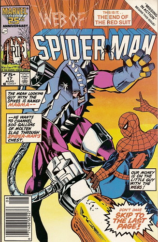
By the time "Web Of Spider-Man" #17 (August, 1986) appeared in stores, Spider-Man had gotten rid of the alien symbiote and had taken to alteranating between a fabric reproduction of the alien suit and his hideous old duds. I'd hoped he'd finally decide to stick with the black-and-whites. But then David Michelinie put an end to the costume controversy with the "nuclear option" of plotlines: creating a supervillain who wore the alien version of the costume, and then having him assault Mary Jane. So much for Peter Parker ever wearing black again, huh? (Jeebus. It's like a candidate in a Presidential debate using a shotgun on his opponent.)
Of course, the Spider-Man franchise has had myriad problems since the late 80's *coughCloneSagacough* so an ugly (yet inexplicably popular) costume really is small potatoes when compared to all the rest of it. Still, I really miss that costume.
*Not you guys! You guys are great!


10 comments:
I remember talking to an old friend with an enourmous comics collection about this. With the exception of the stupid webshooter placement, the black costume was better designed and easier to draw.
In the course of the discussion, we came up with two reasons why it couldn't stay.
Firstly, it corresponded with a sad period where Marvel's printing techniques really went down the tubes. The Flexographic process was making everybody's art look like shit, and just couldn't handle a complicated costume like the old Spiderthreads. As production techniques got better, the new costume reawakened bad memories of the dark era before.
Secondly, the black costume looked just a little too slick. The original really looked like something put together by a teenage genius with no fashion sense, and carries with it references to the hero's highly formative and often-referenced origin story. This sort of visual link to the past may have been considered more important than good taste.
Drawing all that webbing is finnicky but all those lines make foreshortening his figure really easy. When you've got a guy as fond of bizarre, splayed-out poses as Spiderman the original suit design is like a blessing to the artist.
That Magma costume is horrendous! You certainly showed more restraint than I possibly could by not commenting on that.
With regards to all the busy webbing, I seem to remember watching the old '60s Spider-Man cartoon and sometimes the artist would just not draw the webbing in, even though it was there in other scenes! That just looked slapdash and made the animators seem lazy. When it comes to simplifying Spidey's costume you get the same problem, it looks like the artist just didn't want to draw all that damned webbing anymore.
The Iron Spider costume is a bizarre compromise. On the one hand, it's relatively simple. On the other hand, artists seem to add those back-tentacles in whenever possible, even when they're not actually doing anything!
I always thought Marvel missed the boat by not trying to have Peter pretend he was an all-new superhero to escape the hounding of the police, his frequent foes, and JJJ after he came back from the Secret Wars. "Uh, no, I'm not Spider-Man...I'm Arahnid! A totally new super-hero!"
Doing so would mean he'd have to curb his usual trademark banter, which would be extremely tough for him, and probably somewhere along the line the Bugle would accuse him of having murdered and replaced Spidey. Then the truth would come out and Spidey's name would be mud in Manhattan, just like always.
Yeah, they did something a bit similar when Spider-Man took on four different new identities several years later. That didn't quite work the way I thought it would, either.
I'm a diehard traditionalist when it comes to Spidey's costume. Of course, until I encountered your blog, it had never occurred to me to apply fashion sense to comic books. :)
I don't get the "original Atom" connection, though. Wasn't his costume yellow and blue?
Here's where I be a bad fanboy:
The Clone Saga dates from the mid nineties - you can tell because of the foil/hologram/prison bar cutout/etc covers that show up every other issue in the damn thing.
And you're thinking about the second Atom rather than the original Atom.
I'm with Jay on this one: I was far more concerned about the spandexed, armored ubergoober on the cover than I was with Spidey's costume (course, my fashion sense is near zero, so that shouldn't surprise me). I mean, I suppose it's not the worst costume I've ever seen, but the freaking spikes and the...thing on his left thigh (what is that doing there anyway? Besides looking needlessly gaudy, I mean) and the coal miner's glove, it's like a patchwork suit of crap. Was this guy ever seen again after this comic, or what?
I fixed the Atom reference in my post; somehow the Golden Age Atom had completely slipped my mind!
Anonymous: I have no problem with the black costume looking slicker than the red-and-blue. I think it worked as a nice symbol of an evolving character. Of course, heaven forfend a comic book character evolve! That's one of the things I dislike about long-term superhero comics -- the "treading water" aspect of their continuity. My solution? Change the whole business model and abandon the monthly-forever format in lieu of shorter runs that advance the characters wihtout regression, plus constant reprinting of trade paperback collections. But that's a whole 'nother debate.
Flidget Jerome: Good point! Does it bug anybody else how John Byrne will draw black costumes without any highlights on them whatsoever and they end up looking as flat as (burnt) pancakes? No? Nobody else? Just me, then? 'Kay.
Jay: Magma wasn't worth my time. Besides, I had lyrics to write! I agree that the old red-and-blue design looks bizarre sans webs, whether it's in a cartoon or even in certain panels of certain comics.
Bully: Awesome idea!
Anonymous: I was so busy working on those lyrics I didn't proofread my blog closely enough. Dopey me! The reference is fixed now.
Mark: Fixed the Atom reference. Not sure how I screwed up the Clone Saga reference, though. I never thought the clone stuff happened in the late 80's -- I just mean it happened since this particular comic was published. BAD FANBOY! (brandishes rolled-up newspaper)
Crowded House: Was this bad guy ever seen again? I sincerely hope not.
I think it worked as a nice symbol of an evolving character. Of course, heaven forfend a comic book character evolve!
While I agree with you in the larger issue (any character written continuously for over forty years SHOULD evolve), I dislike the idea of costume change as shorthand for it. Mostly because too often it replaces real character evolution with superficial change.
How do we know Wolverine's really been hit hard by Jean Grey's death? He's changed his shirt.
How do we know Bart's decided to be more serious about superheroics? He's changed his pants.
THAT'S NOT CHARACTER GROWTH, THAT'S HAVING MORE THAN ONE THING TO WEAR!
'Sides, I'm an iconic image kind of guy. Once the image is set, minor tweaking from artist to artist is okay (like the 60 years of Superman's costume), but complete redesign feels wrong.
I grok you, Steven. I guess our main difference of opinion is that you like the red-and-blue suit, and I don't. So I was happy to see it replaced, and it was something that could be explained by Peter's maturity.
Post a Comment