
This one's from a "Loren Lassiter." Well, that's obviously a made-up name. Where'd you swipe it from, "Loren"? Some old "Superman" comic? Yeah, I thought so. Nothin' gets past Blockade Boy! (Unless it moves a few feet to the left or right, first. Then it's smooth sailing.)
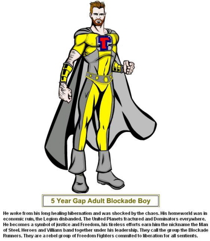
The lines are reminiscent of Dave Cockrum. You can see the Cosmic Boy influence. The two tone combination is in the style of Steve Lightle. The bracers are Hercules like to give him the air of power and strength. The Interlac "B" is of course a homage to the Superman emblem. I hope you like it, hairy body, nipples and all. Your site has provided me with a good laugh when I really needed it. I love your costume designs.Thanks, "Loren"! (If that is indeed your real name.)
I love all the detail you put into the costume's story, and the idea of paying tribute to so many Legion fashion designers. Still, I'm sorry to say I'm going to pass on this one. It's almost there, but not quite. I like the bracers, especially combined with the bare arms. The cape is a nice touch. And I love how you played with positive and negative space, joining the sides of the emblem to the collar and to the yellow/gray shapes on the costume. I'm not so sure about the belt. Maybe if it had been larger -- and therefore bolder -- in proportion to the rest of the costume. Also, that long, broad, bright stripe of yellow needs to be broken up by a thicker shape. Stylistically, the belt needs the droopy 1970's boots to keep it from looking out of place, so it was wise to include them. My biggest objections to this costume have to do with the color scheme and the emblem itself. I think gray and yellow can look just fine together. However, when you use them in near-equal amounts, it's a good idea to make one color much darker than the other to keep them from canceling out each other's visual impact. In this case, a much darker gray would have helped. As for the emblem, the red-blue clash with all that yellow and gray, and they're not repeated anywhere else on the costume. And while I understand that you wanted to stylistically mimic the Superman emblem, it still looks kind of chunky and formal compared to the rest of the outfit. I dunno. Maybe that sort of thing only worked with (for example) Kon-El's old costumes because it was the genuine Superman emblem. That thing's become iconic, where you can slap it on anything and nobody notices if it actually looks good or not.
Man, I'm turnin' into a total hard-ass with these critiques, ain't I? I hope I don't scare off any potential contest winners!

5 comments:
So Loren is using HeroMachine, like I am :P Good to see I'm no the only one without drawing abilities who's trying it out, and I dig the Legion artist references (though it's too yellow for my taste).
I actually am really appreciating the critiques you're providing for the applicants. I like to think I know what a good costume looks like, and have designed a number of what I obviously think are fine for the supers game I'm in, but I find it hard to isolate exactly why a costume is good or not. So this is very helpful to me. Perhaps one of my players could use a link to this site...might help him move away from the "shorts with long sleeves" combo...
Ugh... shorts with long sleeves is a no no, but acceptable in the right circumstances. It's shorts with briefs that is an absolute crime against fashion.
Magnus have you tried the new expansions in the dropdown boxes on Hero Machine? They do add quite a bit to your options.
I appreciate the attention you gave to my work. I have always had a knack for using the positive and negative space. Thanks for noticing.
Your are dead on about the colors. Yellow is a hard one to play with. A dark grey would have worked much better with less yellow. I used yellow only because it was part of his original costume.
The emblem was very risky. Originally I made it without. THe shirt ended in a V exposing his hairy chest.
Thanks for letting me play it was fun. (-:
Oh and BTW I am indeed Loren Lassiter. However I tend towards the Lex Luthor end of the LL spectrum. Those goody two shoes LLs have been nuthin but trouble for me growin up. Watch your back Lane.
Lauren, yeah, I use HeroMachine 2.5 Beta, latest I could get my hands on. Much improved from 1.0.
Post a Comment