Friday, July 21, 2006

Rescue Me: Hellrazor

Ruthless. Greedy. Amoral. Tasteless. And dead! The victims of the villain-killer Scourge have many flaws. I could have helped them with that fourth one.

Hellrazor (first appearance: Marvel Team-Up #87, November 1979) had a very 90's name and powers (he shot razors at people) but a very 70's look. He's dressed for the ballet adaptation of a Gor novel! I just can't say it enough: What the hell?!! Still, the combination of the Ye Olde Renaissance Faire look and the name "Hellrazor" intrigued me. So here's how I would have costumed him:

myhellrazor

Just wristbands? Screw that shit! I say, "armor the fucker up!" So we have a plate armor suit with a Dark Ages twist -- devil helmet, boots that look like animal feet, and claws on the gauntlets. And then I added a hooded tunic to bring it all home. Y'know, I really wanted to go buck wild with the horns -- make them gigantoid and majestic, but they would have made the hood unwearable and also it would have been one more thing for a good guy to grab 'hold of whilst punching Hellrazor in the face. I like the way it turned out, though.

Next: Who is the Mechano-Sarge, and how does he help me usher in a new challenge?

Wednesday, July 19, 2006

Gender Reassignment Challenge: Black Canary To Black Eagle

In the Gender Reassignment Challenge, I take a superheroine with a very feminine look, and I redesign the costume for a male hero. My goal is to use as many elements of the original costume as possible without the hero looking like a man in woman's clothing. With fashion, the lines between "masculine" and "feminine" can be whisper-thin -- remember George Costanza and his Gloria Vanderbilt eyeglasses?

I've gotten a lot of requests to do a male version of Black Canary. She's a tough one, alright. Probably because she looks like a cocktail waitress. The bustier, the tight little jacket, those darned fishnet stockings--! It's a real puzzler. A few months ago, I did some sketches of a Man-Canary (and no, Scipio, I'm not calling him that!) but I never could come up with anything I liked. The closest was this godawful baggy hip-hop outfit with a lot of mesh. It sucked. And it would be a total cop-out for me to just draw a guy in a tuxedo. But I think I came up with a decent -- and very modern -- solution.

mancanary2

Here's a guy I call the Black Eagle. 'Cause that sounds manlier than "Canary." He's dressed like a pro wrestler. The jacket, trunks, and boots are all leather. (Down, boys.) I figure Stone Cold Steve Austin could get away with wearing black leather trunks out in public, so why not this guy? I approximated the shape of the Canary's bustier with an eagle tattoo. I also used tattoos in place of the fishnet. It's criss-crossing lines of barbed wire. Badass, am I right? I even kept the long blonde hair from the female version, only now it completes the look of a big, strapping Nordic dude. Lotta Viking blood in there.

Next: a "Rescue Me" design for Hellrazor!

Rescue Me: Megatak

Megatak, a.k.a. Gregory Nettles (one of the most delicate, hand-milled English soap-sounding names for a bad guy I've ever heard) was an industrial spy who got "electro-kinetic" powers during a botched theft at a trade show. He was costumed as 1983's hottest new video game character, Megatak (by "Nogari") and the accident had the side-effect of driving him bonkers and making him think he was the character. This was a Doug Moench plot. And if you remember my Zaniac post, then you know it's not the first time he's used it. As Megatak, Gregory could absorb electricity and use it to create "electro-magnetic constructs" -- favoring video game characters as his models. The constructs could then discharge energy, blasting all who opposed them. He showed up in Thor twice, about a hundred issues apart. And in his second appearance, Scourge killed him.

When Marvel's editors were drawing up their list of bad guys to unceremoniously frag, Megatak's name was probably the first one on there. And it was probably scrawled in huge cursive letters with a lot of flourishes, like John Hancock's signature. While I don't agree with their decision, I'll admit there were some serious strikes against the poor dope:
1. A stupid name that tells me absolutely nothing about what he does. Before I did any research on him, I assumed he was some sort of giant robot.
2. A goofy costume. Take a look.
3. A sorely overpowered opponent. That's the part that most baffles me. Who the hell creates a villain with electrical powers and then pits him against The Mighty Thor? I could see him faring better against Power Man and Iron Fist, but as a Thor villain? Come freakin' on. And now for the stinger (if you haven't read the link I'm cribbing this from): Megatak was getting his balls handed to him by Sif at first, but then Thor showed up and asked her if he could wail on Megatak for a while and Sif was all like, "Whatever. Go for it."

But I don't think Megatak was necessarily lame. I think he was just in the wrong comic at the wrong time. Especially with that second comic. Ouch! Here's how I would have handled him:

mymegatak

I think Megatak would have made a fun, weird villain against one of Marvel's wisecracking heroes, like Spider-Man or She-Hulk. The fact he can bring video game characters to life makes him a contemporary version of the Golden Age Superman baddie, Funnyface (who did the same thing with thinly-disguised versions of famous comic strip characters). I like the visual contrast between 8-bit, 2-D graphics and a more realistically drawn human character. I don't see why Megatak couldn't have created electro-magnetic versions of video game weapons, either. I think that would have looked cool. And the best part is, Metatak could still work today! Especially if you ditched the insanity part and just made him a retro-gamer who was into the old Atari 2600-era stuff. He could still be an industrial spy or hacker or what-have-you. And can't you just see him conjuring up a giant version of the Atari 2600 Pac-Man, all flickery and lame with the busted doorbell sound effects (*TONK, TONK-TONK*) and then it bites your arm off.

I tried to make my Megatak design work as an actual costume but I think it looks better as gussied-up street clothes. The mask is sort-of aviator goggles, with rectangular lenses. His hair stands straight up from the static he absorbs. And the logo is a giant M with a monster face on it. Kind of like Space Invaders but without the antennae.

Next: Gender-Reversed Black Canary! (You asked for it...)

Monday, July 17, 2006

Rescue Me: The Basilisk

ff289basilisk

Here's the Basilisk in "Fantastic Four" #289 (April 1986) and it's the first time I ever saw him. I thought, "Hey, this guy's kinda cool!" And on the next page, Scourge blasted him through a window on one of the higher floors of Four Freedoms Plaza.

Apparently a lot of people -- or a very small group of people with great influence-- thought it wasn't worthwhile to keep the Basilisk around. I'm not sure I understand why. According to Wikipedia, the Basilisk had superhuman strength, stamina, and reflexes, and could project beams of intense heat, cold, and force from his eyes. He could fly. Hell, he created a volcano in the Hudson River! Seems like a decent enough supervillain to me.

I can only think of a few things wrong with the Basilisk, from what I've read:
1. His real name: Basil Elks. Pure comic book, that, but it plays better in DC comics instead of the arguably more realistic Marvel Universe where the names are mainly alliterative. You don't generally get a lot of characters walking around with civilian names like Hugh Mantorge or Will Verene.
2. His powers, at first glance, seem generic. What's worse, he got them (in an accident, natch, this being Marvel) from a Kree gemstone. And then he boosted them by using a second Kree gemstone. Criminy. First Moonstone, then this guy. I don't know what the problem is with the Kree that they can't keep their power-bestowing gemstones on their own freaking planet. That shit's like the Marvel version of Kryptonite. But don't forget he's got the eyebeam gimmick, people! And he's called the Basilisk! That's his hook!
3. His costume, which features the World's Largest Ascot. Thurston Howell III only dreams of owning an ascot like that. But the costume is not a huge obstacle. I could have fixed it. Behold!

newbasilisk

Keep on truckin', Basilisk! In some legends, the basilisk has yellow scales. So for the Marvel capital-B Basilisk I designed a golden/bronze-y glam rock armor for him. Dig the KISS boots. Since he's green and scaly, I wanted to show off a lot of his actual skin. That's why I didn't give him a helmet or cover up his shoulders. Also, you may notice that I didn't draw in any nipples. That's because, since he's reptilian, I figure he wouldn't have any nipples. Nice, huh? It's a real win-win situation, since I enjoy drawing topless males, and a lot of my readers hate seeing (male) nipples.

Tomorrow: Megatak!

Saturday, July 15, 2006

Rescue Me: The Vamp

oldvamp

She's fifty and fabulous! Isn't it great how Gramma can still fit into the slacks she wore in 1968? And I think the facelift is settling quite nicely. I'm sorry, but when I hear the name "Vamp" I don't think of somebody who looks like this. Like a swashbuckling Gibson Girl with Leonard Nimoy's face. Also? Brainiac 5 called; he wants his belt back.

The Vamp was an agent for a criminal organization called "The Corporation." (Insert Enron joke here.) They cave her the power to transform into the Animus, a frankly awesome-looking creature that was a goggle-eyed, big-brained future guy crossed with a brawny caveman, dressed in animal skins and wielding a ginormous crystal club. The Animus rocked. The Vamp? Not so much. Although she did manage to infiltrate America's top security agency. S.H.I.E.L.D. even gave her that belt, whch somehow allowed her to absorb any foe's powers and skills. Anyway, long story short, the Vamp eventually got killed in that "bar with no name" massacre that Scourge pulled off, and then somebody cloned her, and then the clone got killed. There's more to it than that, of course, and it involves Typhoid Mary and Deadpool, but I really don't have the time or interest to go into it.

So, how would I have dressed the Vamp, if I'd had my 'druthers? Like so.

newvamp

I wanted to incorporate the style of a silent-era, honest-to-goodness VAMP into her costume, since that actually makes sense. So I used Art Nouveau/Japanese sinuous iconography on the bodysuit. Where's the belt, you ask? Good question. I really wanted to use the twisting snake thing, and the belt -- or any belt, really -- didn't look too good in conjunction with it. So instead I miniaturized the technology and put it in that flower on her waist. It's supposed to look raised, like it's a brooch or sumpin' but that part didn't turn out too good. Ah, well. I also did some sketches where her hair was pulled back (too severe and/or dowdy, even if done in an Oriental way) or in a wavy bob (made her look too much like Lady Viper) or a straight bob (very Louise Brooks but I personally don't think it's very sexy). I like the long, wavy look, like Theda Bara wore as Cleopatra. And I figure Black Canary can do martial arts with long hair, so the Vamp wouldn't have any problem either.

But what do you guys think?

Friday, July 14, 2006

Moral Realignment Challenge: Green Arrow And Clock King

Jeremy finally consented to let me have my own Flikr account, so everything's a go!

realclockking

Look out! Green Arrow's got a Mulling It Over arrow! Hmmmm...

Maybe that joke was lame, but it's not nearly as lame as Clock King's costume. He's dressed for scuba diving, for Chrissake! There's nothing intimidating about him at all, other than the fact you can't see his face, and the notion that he's so batshit crazy that he thought that costume was a good idea. Does he need a costume redesign? But of course. But he's a bad guy, so I could only live with myself if I did it hypothetically. Unlike my other costume designs, which really happened. So let's put him and that dirty hippie Green Arrow in the Moral Realignment Challenge! That's the one where I switch the roles of a hero and a villain and imagine how they might have appeared in the world of comics.

Let's go!

Excerpted from the essay "Changing Times: Clock King In The 60's" from "Alter Ego" #38 (2004) published on Earth-P:

silverageclockking

"...and most notably, bringing in leggy France Nguyen to replace Barbara Eden in the role of the Black Canary. But even these tweaks couldn't increase the show's popularity with a viewing public that had grown tired of camp -- and only halfway through its fourth season, the 'Clock King' television program was canceled.

The Mechanically-Minded Marvel continued to enjoy success in his original medium of comics. By 1968, Clock King was featured in five monthly DC publications. In addition to 'Clock King' and 'Inventive Comics', he was a member in good standing of 'The Six Scouts Of Triumph' and enjoyed team-ups with Calendar Man in 'All-Time Finest Comics' and with a rotating slate of guest-stars in a former Western title, 'The Big Hand And The Little Hand.'

Still, the swift demise of Clock King's TV show weighed heavily on the minds of DC staffers. For years, they had intentionally mimicked the program's light, comedic tone in their comics. Now, they worried that the comic book audience was going to turn on the character just as the television audience had done. In a weekend-long brainstorming session, plans were laid out to dramatically overhaul the character. Familiar gimmicks such as his boxing glove cuckoo clock and his sundial hover-discs were scrapped. Stories would return Clock King to his pulp-era roots, placing a much stronger emphasis on his detective skills, and reestablishing his personality as a curmudgeonly genius with an obsession for order and logic.* To signal Clock King's new direction, he was given a visual makeover courtesy of superstar artist Neal Adams. Adams discarded many of the lingering Golden Age elements of the costume, including the trunks, the enormous sash, the large 'K' on his chest, and even his crown! Clock King's new look featured Roman numerals, sleeker boots and gloves, a new cape inspired by the Elizabethan era, and -- quite startling for the time -- a fanciful, three-pronged beard. The beard, while undoubtedly quite regal, was also a blatant marketing ploy by DC to appeal to the college-age market. Although the letter columns were beset by angry fans demanding to know how Clock King could wear such distinctive facial hair in both his superheroic and civilian identities without anyone noticing, DC's editors refused to address the issue. Within a year, most readers seemed to have accepted the situation, perhaps chalking it up to 'the magic of comics.'

newlookclockking

DC launched Clock King in his 'Startling New Direction' (as the cover blurbs on his comics phrased it) with 'Inventive Comics' #381 (October, 1968). The classic story pitted him against one of the most lurid foes of the hero's early days.

The Green Arrow was a ghastly, violent figure, and had appeared in comics only once before. As told in "Inventive Comics" #30 (August, 1939), the Green Arrow was originally a mortal man named Oliver Queen. Queen, a dashing but arrogant sportsman, knowingly trespassed on a sacred Native American burial ground while bow-hunting and was cursed by a 'savage witch-doctor.' The archer was struck dead on the spot, only to be resurrected as a zombie-like killing machine who would systematically murder nearly every member of his family. The gruesome tale concluded with Clock King crushing the monster within the workings of a printing press.

The 1968 story, with a script by Bob Haney and artwork by Adams, reintroduced Oliver Queen as a corrupt millionaire who had dropped dead of a heart attack while lobbying to dump chemical waste in a reservation. Reanimated by his own bigotry, the new version of Green Arrow embarked on a killing spree of every Native American who had ever opposed his business interests, framing a handsome young activist for the crimes. Clock King cleared the man's name, punched a rabid coyote in the face, crushed the Green Arrow's living corpse beneath a totem pole, delivered a stirring speech on tolerance and jumped over a gorge in a souped-up dune buggy.

*The quirkier, more fairy-tale aspect of Clock King would not be seen again until 2002, when his two surviving comics were helmed by Grant Morrison and Neal Gaiman.

...Yes, my Clock King redesign is very "Royal Flush Gang" but I can't help it; I just love their look so much! The same goes for Jack Of Hearts. I originally was going to put clock hands on his chest but it looked too busy. And the beard, for me, was the icing on the cake. Green Arrow's beard comes to two points? Clock King's comes to three! Take that, hippie! As for Green Arrow himself, I thought about going the right-wing paramilitary route with him or making him a Manson-type hippie cult leader. But I didn't want to make him look too similar to Evil Flash. And then I hit on the Solomon Grundy riff and everything clicked. The Silver Age costume for Clock King, by the way? I don't honestly think it looks good. (Trunks over tights? *shudder*) I just wanted to show what he might have looked like as an old-fashioned hero.

Wednesday, July 12, 2006

Rescue Me: Mirage

mirage
Mirage: smarmy, boastful, a piss-poor tactician, just won't shut the hell up, plus he has handles on the sides of his head. It's no wonder Scourge wanted him dead! Of course, if Mirage had bothered to consult me about his sartorial decisions, he might still be alive today. (It's ain't braggin' if it's true.)

That's his second comic book appearance up there. His first was in a Spider-Man comic, and his scheme back then was to rob a wedding. Is that -- why would he -- I mean, does that even happen? I guess there's be a lot of swag there, but there's also like two hundred witnesses. Imagine getting your ass kicked by the groom's beefy, truck-driving aunt. I dunno. Anyway, the whole thing sounds like a Gerry Conway plot if ever I heard one. But it's actually one of Len Wein's. Mirage got crushed by a chandelier at the end of it. But he rallied for that "Marvel Two-In-One" cameo where he got clobbered by Daredevil. His third appearance was in "Captain America" where Scourge shot him to death. The end!

Okay! Without further ado, here's how I would have dressed Mirage. If he'd asked me to dress him.


Ooh! Mysterious. No, it's not Captain Universe, The Hero Who Could Be You But Let's Be Honest Honey That's Never Going To Happen. It's Mirage, in my ethereal new costume for him! Because of the codename and the theme (holographic impersonation) I went more poetic and arty this time. It's very Neal Gaiman. And very plain old-fashioned gay. It's even gayer than my Black Condor design, which doesn't even seem possible to me but there you go. Like it or lump it.

The colors are pale because when I think of a mirage, I think of illusory water shimmering against a blue desert sky. And it's more ghostly. If he'd had the common sense to keep the damned image inducer activated most of the time, then this would have been a very dramatic, alien look that a hero would have glimpsed only briefly before Mirage slipped around a corner or into the back of a limo. The cowl includes an immobile, sculpted face mask. With big, big Silver Surfer eyes. (Mysterious!) And I carried over the stripe and diamond motifs, but I think I used them in a more restrained and interesting way than he did.

In other news, I really struggled with the Clock King/Green Arrow deal but I finally conquered the conceptual part of it and now I just have to draw the dang thing. Oh, and I found a picture of Megatak online and holy cats is that ever an awful costume! I must help him!

Tuesday, July 11, 2006

Rescue Me: Shellshock

old shellshock

Here's the second beneficiary of my new plan to redesign the costumes of anyone Scouge has ever killed, or tried to kill: Shellshock! Okay, maybe "beneficiary" is overstating things, since Shellshock is dead. And rotting!

Did you know... Shellshock was created by Stan Lee and Jack Kirby? I shit you not. I read it on the internet; therefore it must be true. It turns out he first appeared in "Fantastic Four Annual" #5, back in 1967. He was one of Psycho-Man's henchmen! Only he didn't have this particular costume. In fact, he looked a lot like the Mad Thinker, only in red instead of in green. And his gun was much cooler. Because it was designed by Jack Kirby. Anyway, Shellshock showed up in the above panels from "Marvel Two-In-One" all gussied up for the very first time in a boring new costume and a mask that had no discernable connection to his theme and wielding a convoluted new weapon that looked like a very uncomfortable fusion of a sex toy and a gardening implement. ("The Ass Weasel! By Ronco!") And in his next appearance, Scourge killed him.

Here's the deal: I think Shellshock could have worked as a bad guy. His codename is catchy. And his basic concept is workable: criminal strategist and electronics genius. I think all he was missing was a great costume! With a snappy costume, you're a supervillain that readers want to see again. Without it, you're a supervillain that editors want to see dead. So here's what I would have done:


Shellshock uses a concussive weapon that can blast through walls. So I based Shellshock's outfit on riot gear, since it's meant to resist flying rubble. There's a lot of bulk to it. In addition to the padding on the shoulders and the chest, the costume features thick gloves and protection for the knees and shins, plus a great number of sweatsocks in the crotch (kidding). I kept the color scheme the same as his most recent costume. Navy and yellow is a striking, masculine combination. In place of that stupid catfish mask or whatever the hell it was supposed to be, I gave Shellshock a close-fitting helmet. The shape of the tinted visor is based on the silhouette of the old mask. It's an interesting shape, but by flattening it and making it smaller, I lessen its visual signifigance. On the old costume, it was the first thing a person's eyes went to, and it made no sense whatsoever. Now it's part of an ensemble. In case you're wondering, the strap on Shellshock's left thigh is part of the holster for his gun. See, I don't just throw around straps for no reason, Rob Liefeld. I decided to simplify the gun itself and just give it a "tuning fork" theme. It's still red, for contrast. And I put a matching spot of red on Shellshock's chest with the grenade symbol. This keeps the color of the gun from looking so random.

Any more Scourge victims you'd like me to redesign? I'm makin' a list!

Monday, July 10, 2006

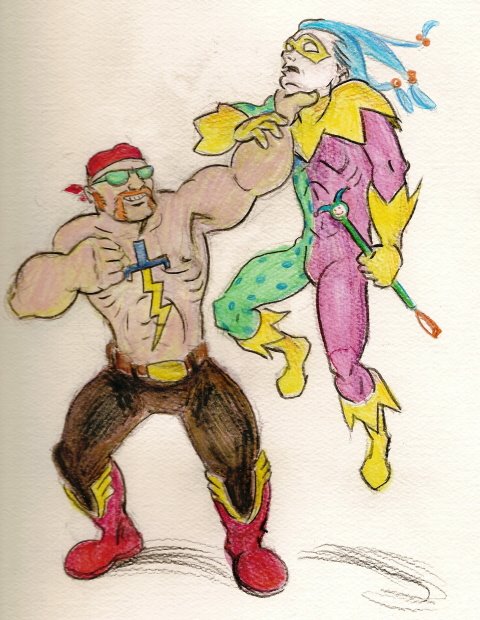
Moral Realignment Challenge: The Flash And Murmur

How might Wally "The Flash" West look if he was a villain? And how might Murmur look if he was a hero? Let's see!


Excerpt from "DC Nation" in the back of all DC comics with a cover date of August 2006, on Earth-Bajillion:

"With the Trickster's heroic sacrifice in the pages of CRITICAL INFINITY, his legacy is in the hands of his mute former sidekick, MURMUR. But the grim, daring acrobat is about to find out that for every legacy hero, there's a legacy villain! And there's none deadlier than the new Flash! Bigger -- and faster -- than his late namesake, this Flash is a brutal drug lord who's determined to rule Peripheral City. Is Murmur agile enough to defeat the fastest thug alive? Or will he end up as a stain on Flash's boots? Geoff Johns and Cully Hamner provide the answer in the pages of MURMUR.

...Fun fact: I almost gave Evil Flash a beer belly. Thank God I came to my senses.

I already knew I wanted to make Good Murmur a motley-clad hero, because Evil Murmur wears a jester outfit already (only it's black leather bondage *yawn* gear). I got rid of the stupid facemask because I've always freaking hated it. It just bugs the shit out of me. Simple as that. So instead I carried the clown motif through with a pale face and with dyed hair that is arranged to looks a bit like a jester's cap -- not completely, since I didn't want him to look like Sideshow Bob, but enough to convey the idea. When he's still, it would be lank and a few locks would hang over his face. I also figure that as part of his gimmick, Murmur would have a morose demeanor and never smile. Which makes total sense since he's a Geoff Johns character, and therefore has nothing to smile about.

I designed Evil Flash to be a stark visual contrast with Good Murmur. Good Murmur wears a costume, so Evil Flash wears street clothes. Good Murmur is kinda slim, so Evil Flash is brawny. And (although you can't really see it here) Good Murmur never smiles, so Evil Flash always smiles. Which is kinda creepy.

And again, no, that's not me as "Evil Flash."

Questions? Comments?

Coming Attractions

I'm on a bit of an artistic tear, which means that posting may happen in the evenings but it will still be daily, Monday through Friday. (And I'm trying to get back on track for morning posting but it might take some time. Please, bear with me). And the really good news (I think) is that it'll be all-artwork for awhile. Here's what you can expect this week:

Tonight: Moral Reversal: The Flash And Murmur
Tuesday: Rescue Me: Shellshock
Wednesday: Rescue Me: Mirage
Thursday: Moral Reversal: Green Lantern And Clock King
Friday: Rescue Me: The Vamp

And keep those ideas coming! You guys are positively inspirational!

Saturday, July 08, 2006

Rescue Me: Turner D. Century

Yipes! I'm late with the post! But I still posted. Because I love you guys. For what it's worth, tonight the Rizza apartment was in quite the uproar. I had to spend hours calming Jeremy down after the vet told him his oldest, fattest cat had a yeast infection. And that he'd have to apply medicine to it every day for the next ten days. What Jeremy was too busy hysterically sobbing to understand is that the infection is in the cat's ears. Anyway, my method of calming him down involved a lot of pimp-slapping and screaming "stop it" but I think I finally got through to him. I'm typing this while he tries to get the swelling in his cheeks to go down.

Okay, let's get this party started.

Many years ago, Marvel's editors -- er, I mean "Scourge" -- killed off a whole slew of their lamer villains. I think these bad guys would have been more popular and therefore still alive if only they'd dressed better. So starting with this post and continuing sporadically in the future I'm personally redesigning the outfits of every villain Scourge ever killed! Even if it was revealed later that the villain survived, which undoubtedly happened in a case or two, this being comics. Just because I'm so gosh-darned thorough. Now, if I was Bizarro Blockade Boy (who turns into a solid steel welcome mat) I'd use my time bubble and actually give these new costumes to the villains themselves, causing the fanboys to adore them and sparing them from Scourge's wrath. But I'm not that guy so I'll just settle for theorizing.


Say, here's one of Scourge's victims, right now! Isn't that handy? Say hello to one of comic blogdom's favorite whipping boys: Turner D. Century! I have an irrational fondness for Turner. It's probably the handlebar mustache. And the name, with its lip-smackingly delicious pun. But in all other respects he sucks hickory-smoked donkey balls. The suit, the flying bicycle, the rip-off Penguin umbrella, and above all his personality, which makes him essentially Super Bill O'Reilly minus the dirty phone calls. Turner needs a makeover, like, yesterday. Because he's dead!

My idea? Ditch the barbershop quartet outfit and get him something like you'd see on the cover of a circa-1900 science fiction dime novel (ex. "Pluck & Luck").


Here's Turner, in my idea of a Victorian idea of a space suit. Which would look something like a diving suit. Rugged, huh? Slung over his back is his gold-plated Electric Blunderbuss, which packs quite the whallop! His helmet (on the ground next to him) I designed to give him an eerie, inhuman appearance. So the lenses are on the sides, like Black Manta. How does he see out of it? By a series of mirrors, like a periscope. (Of course.) I think Turner would have worked well as a Jules Verne type of villain, raiding the outside world in some sort of strange, majestic airship, and taking his plunder to a high-tech Victorian Utopia on an uncharted island. And of course he'd have henchmen. (Another job for Lenny!) With these enhancements, he'd be a fine villain for Iron Man or Captain America. Just for starters!

I won't be redesigning Scourge's victims in any particular order, so if you have any favorites just let me know and I'll work on those first.

Thursday, July 06, 2006

Gender Reassignment Challenge: Marvel Girl To Marvel Boy

With the Gender Reassignment Challenge, I redesign an existing superheroine costume for a superhero. I see how many elements of the original costume I can retain without making the new costume seem feminine. This time out, I chose Marvel Girl, in her Neal Adams design costume.


I figured she'd be an interesting choice. I mean, she's in a dress, for heaven's sake!

To my thinking, putting Marvel Boy in a skirt of some kind, like a kilt of what-have-you, wasn't really an option. It was too "out there" for the character, in my mind. And just putting him in trunks didn't seem to carry over the flavor of the skirt. Especially since I'd feel compelled to add some kind of top, with a neckline and sleeves that mimicked the ones on the dress, just so it wouldn't be a total cop-out. And as long-time readers know, I freakin' hate long sleeves with bare thighs. So here's what I did instead:


Why yes, it is a Nehru jacket! Thank you for playing along at home. But I'd prefer to call it by one of its other names: a Jodhpuri coat. It sounds less tacky that way. The beauty part of the Jodhpuri coat (if you ask me) is its completely straight, level hemline, which at about the same level as the hemline on Marvel Girl's dress. I kept the Marvel Girl's kooky mask, although I was tempted to go simpler when I realized it got in the way of Marvel Boy's shaggy bangs. (Okay, so I could have chosen two better words to end that sentence, but I'm in a time crunch here. Try to work with me.) I had Marvel Boy wear his boots over his trousers so they'd stand out, and even though they wouldn't normally be worn like that with a Jodhpuri suit. But it's more superhero-ish this way! And I put Marvel Girl's X-buckle on a string of groovy love beads. They're way, way out! In more ways than one!

So, whaddaya think?

Wednesday, July 05, 2006

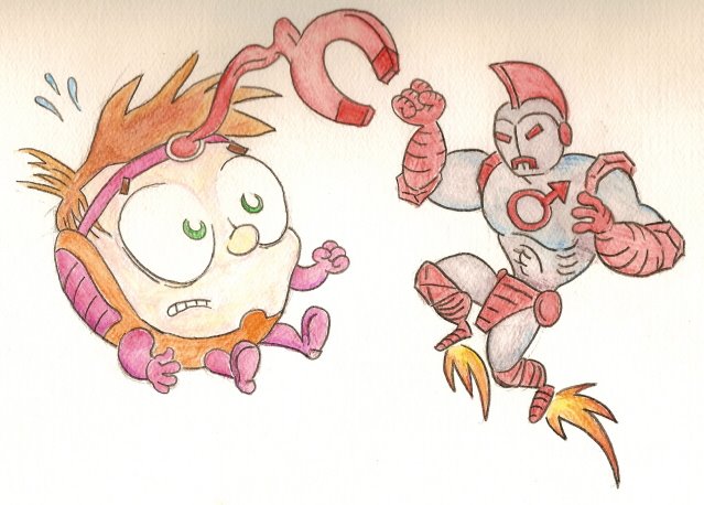
Moral Realignment Challenge: M.O.D.O.K. And Iron Man

More art! As most of you know, with the moral realignment challenge, I try to figure out how a superhero and a supervillain might appear in the comics with their morality reversed. An anonymous commenter once suggested "Iron Man & M.O.D.O.K. -- and if you can do that one, you're a genius." In a stroke of great fortune for us all, it just so happens I am a genius! (And a modest one at that!) Behold!


From the Earth 73.69-B-XVII version of "Marvel Age" #42 (September, 1986):

BIG-HEAD BOY #14 -- The Big-Head Boy, M.O.D.O.K. (Mentally Overdeveloped Designer Organic Kid) is back in his own dimension after his titanic team-up with Harry Osbird, The Green Gobbler. Then why can't anyone at Advanced Idea Middle School remember who he is? There's a new hero in town -- and it's none other than Earth's vilest villain, the insidious Iron Man! The cad has swiped Victor Von Dream's Time Tumbler, and he's using it to superimpose himself into all of Big-Head Boy's past triumphs! Can Big-Head Boy uncover the shocking secret behind Iron Man's demented plan? And can he fix the timestream before he disappears altogether? "Adventures: Disassembled" is written by Stan Kaye, penciled by Howie Post, and inked by Jon D'Agostino. A Star comic. $0.65.

...My first thought was, how could M.O.D.O.K. be appealing enough to headline his own comic? And my second thought was, "If he was adorable." To me, that meant de-aging him and putting him in a comic specifically targeted to children. It followed, then, that the evil version of Iron Man would look like someone out of a Jonny Quest episode. So I made his armor look more old-timey, with a Romanesque fin on the head and a segmented iron loincloth. The joints at the elbows and shoulders are meant to resemble hexagonal nuts. The mouth slit turns down so it's a permanent frown, and of course both the mouth and the eyes glow. The design on his chest is one of the alchemical symbols for iron, and naturally it's also the symbol of the male gender, which was serendipitous. And I made the color scheme red-and-gray, like magnets and old robot toys.

So, what do you think?

Tuesday, July 04, 2006

Gender Reassignment Challenge: Storm To... Um... Er... Storm


Curse those gender-neutral superhero codenames!

I haven't done one of these in a while. So if you're new to my blog, here's the deal: the gender reassignment challenge is where I take a very feminine superheroine costume and reimagine it for a male hero, retaining as many of the original costume elements as I can while still keeping it "butch." Dave Cockrum's swimsuit-style designs are probably the most difficult of these for me to do. I've already redone Saturn Girl's outfit -- with limited success. Storm's was much easier. Mainly because it wasn't pink. Here's what I came up with:


So it turns out Jeremy had some watercolor pencils! Thank GOD. I didn't mean for it to look that purple but I was afraid I'd make it too dark and murky otherwise. Ah, well.

The first thing I did with the costume was to detach that cape from the bracelets, because I freaking hate that shit. (Just ask the Black Condor! I bet he's still nursing the split lip I gave him from our rumble over that very issue.) I also did it because I've only ever seen that look on Ziegfield Girls. I gave Man-Storm a beard and modified the tiara-thingie into a wraparound. This was inspired by Kirby's Brother Bear from "The Forever People." I shortened the boots from thigh-high into more of a buccaneer style, and I changed the oval cut-outs into rubies, to match the one on the cape. I did that because cut-outs make me think of go-go dancers and not super-guys. It's the same reason I reinterpreted the cut-outs on the sides of the stomach into a belt -- and to show off a similar amount of skin, I made the outfit topless. But I'd rather not see thighs with buccaneer boots, so I covered those up.

So, what do you think?

Monday, July 03, 2006

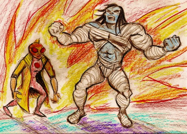
The Hell--?! Artwork?!! (Moral Realignment Challenge: Apocalypse And Jubilee)


From Marvel Comics solicitations for October 2005 (on Earth-427B):

BEST OF ESSENTIAL APOCALYPSE VOL. 1 TPB
Written by STAN LEE, ROY THOMAS, JIM SHOOTER, DAVID ANTHONY KRAFT, BILL MANTLO & WARREN ELLIS.
Cover and pencils/inks by JACK KIRBY/GEORGE ROUSSOUS, ROSS ANDRU/FRANK GIACOIA, P. CRAIG RUSSELL, SAL BUSCEMA/JOE SINNOTT, ERNIE CHUA, BOB HALL/DAN GREEN & LEONARDO MANCO.
Just in time or Halloween, it's a collection of the first and best appearances of everyone's favorite gray goliath, Apocalypse! Includes his debut in 1960's "I Awoke The Mega-Mummy!" from "Journey Into Fantasy" #45, his reappearance as one of the Defenders in 1971's "Marvel Main Attraction" #1 (also featuring Doctor Mordo, Attuma The Aqua-Warrior, and Planet-Eater Lad), his first battle against the psychotic super-powered delinquent Jubilee in the pages of "Red, White & Blue Skull" #183 (1975), the groundbreaking story in which Apocalpyse saves a young man from a gay bashing and also comes to terms with his own homosexuality in "Rampage Of Apocalpyse" #7 (1977), Jubilee's terrifying transformation into the Kree-powered menace "Firestone" in "Awesome Apocalpyse" #54-55 (1978), Apocalpyse's titanic tussle with a fellow hero in "Bullseye: The Man Who Never Misses" #159 (1980), and his triumphant return from Comics Limbo in the mature-readers-only "Apocalpyse: Prince Of Death" #1 (1995).
180 PGS./B&W/MARVEL PSR...$9.99
UPS: 7200411582-00111

Boy, I really need to get that Illustrator program, don't I? I can't seem to get the hang of Jeremy's colored pencils at all. (I lost my pastels; so sue me.)

Annnyhow, here's my interpretation of Steven's idea of realigning Jubilee and Apocalypse. I did some reading-up on Apocalpyse and found out he was an ancient mutant who swiped some Eternals technology for his body-suit. So I figured if he was a good guy, he wouldn't have the suit. Ergo: Mega-Mummy! Good Apocalpyse is strong like the Hulk and has regenerative capabilities. Bad Jubilee is a mutant street-urchin who uses her powers to start fires and kill people, and to make her more of a match for Apocalypse, I juiced her up a la Moonstone. I ended up redrawing her a bunch of times and I'm still not happy with her but to be honest I'm also not that interested in her. What I was most into for this assignment was imagining Good Apocalpyse's publishing history as a cross between a Marvel Monster and the Hulk.

I'll try for more artwork posts this week.

Wednesday, June 28, 2006

Five-Day Weekend!

I'll be taking a short break from posting since -- due to a deeply disturbing coincidence -- Jeremy and I will be touring the exact same laminate flooring plant at the exact same time. (And the fact that this is my second consecutive absence involving laminate flooring just makes the whole thing even creepier.) Bottom line? Posting will resume on Monday.

Jeremy has to go on this plant tour as part of his job. I, on the other hand, am doing it for charity. It seems the fondest wish of a little girl with lukemia is to travel in a helicopter to a laminate flooring plant with Power Man, Iron Fist, and myself. I guess she really likes this blog! I'm not great with kids, but I'll bring along some Japanese fashion mags to keep her occupied.

Tuesday, June 27, 2006

America's Next Top Deformed Murderer

Two decades before "The Janice Dickinson Modeling Agency" and "Project Runway," the dark side of the fashion world could be found within the pages of "Detective Comics" #506 and #507 (September and October, 1981). In those issues, the Dark Knight squared off against the Manikin, a statuesque fashion model with a burn-scarred noggin and an exoskeleton...


...an exoskeleton plated in genny-wine gold! 'Cause it's classier that way! It's certainly Trumpier! But you know what would have made it even better? If it had been Faberge! All crusty with jewells and enamel and crap. And if you could order it from the Franklin Mint. But here's the weird thing about this scene: a few panels before this, the Manikin was wearing a floor-length gown, cinched at the waist, with long sleeves. And Batman somehow managed to pull it off her, over her head, while she was punching him in the face. I guess that's a skill he picked up in his "Bruce Wayne" identity.


As part of his investigation, Batman shows up unannounced (as is his wont)at the apartment of Catwoman. He finds her all dolled up for her Aquaman fantasy session with Dane Dorrance. Oh wait, Frank Miller hadn't retconned her into a former prostitute yet. My bad. I'll start over.

He finds her chilling in her sequined pajamas and casual lounging heels. Take a look at the floral arrangement. Cattails! Oh, for... give it a rest, woman.


"When I'm not wearing my Catwoman costume, I like to dress well." But if she thinks her costume is tacky, then why does she wear -- gah! It's Gerry Conway logic; I'm not going to waste time trying to think about it. Just like I'm going to stifle my disbelief that she could identify the maker of that dress so quickly.

Batman uses this info to track down the Manikin's next victim, "Hoston." I love his Fruit Pies! (And that's the least dirty-sounding Hostess product I could think of for that joke. I just wanted to make a joke on his name, but it keeps unintentionally veering into Sex Country. But I guess "Fruit Pies" is marginally cleaner than the alternative. Twinkies, Ding-Dongs, Sno-balls... they're all filthy! ...That's what she said.)


Here's how you know it's pre-Crisis Batman: "I guessed wrong!"

I also like this part: "A weighted golf-club can kill." This message brought to you by the Coalition Against Weighted Golf-Clubs.

The Manikin only hospitalizes Hoston (good job, Batman!) but then she decides to show up there and finish him off. Luckily, Batman has a brilliant plan.


"The Brave And The Bold" presents: Batman and Tom Selleck's Mustache! What an awesome crime-fighting team! Batman... seriously. Dude. That's it? That all you got? Not even a curly blonde wig or some big Charles Nelson Reilly glasses? I'm severely disappointed in you.

You could have at least made it a handlebar.

Monday, June 26, 2006

Booblivion

The other day I asked Jeremy just what the hell he was thinking when he bought "Oblivion" #1 (Comico, August 1995). He just shrugged and said, "Art Adams cover." I thwacked him on his forehead with my thumb and forefinger and asked him if he'd even glanced at the interior before he'd bought it. He said "No." So of then course I had to punch him in the arm really hard. But he didn't even flinch, the l'il trooper!

Well, it doesn't surprise me that Jeremy didn't look through "Oblivion" before he bought it. "Oblivion" is a comic about perfectly awful people doing perfectly awful things to one another, and Jeremy only likes that on reality TV. Okay, so he used to enjoy Warren Ellis but he got sick of that guy about five years ago. And "Oblivion" author Jack Herman is no Warren Ellis.

But of course, what I find most offensive about this comic is the costuming.

While I applaud the idea of a gold-plated handgun to go with gold satin boots, I'm just not buying this as a military uniform. Winged knees do not authority confer. (I think Sun Tzu said that.) Then there's the busty chest plate, which lifts and separates the holy hell out of her breasts. Doesn't look comfortable. And I'm pretty sure she stole the facemask thingie from 90's-era Jean Grey. Do you think the collar is a mite wide? The guys in this comic get even wider collars. Their heads are practically swimming in the damn things. I bet penciller Andrew Dimitt had a problem with people touching him on the neck.


Oh, come freakin' on. How long does it take these women to get suited up for battle? Three hours? I remember an old "Project Runway" episode where some guy had designed a swimsuit with less straps than this and neither he nor his model could remember how to even get into it the second time. Plus, you have to love how after all that strappy foofarah there's still several square yards of skin exposed. Well, at least their knees are well protected, huh?


Of course she's the commander. Isn't fishnet the universal symbol of leadership? You can't see it in these panels, but the fishnet is also the only thing covering her ass. Aaaannnd the whole get-up is backless! Jibbidy. You know what I'd like to see? A remake of "Gettysburg" where all the combatants are clad only in leather jockstraps. And their preparation for the big battle would involve a lot of scented oils.

But wait! "Oblivion" finds other ways to objectify the female body!


If they'd only stay little 'til their Carters wore out, huh? Osh-Kosh B'HOLY SHIT! And what precisely is keeping her breasts inside that thing? Is it just exceptionally cold in there or what? And the even stupider part is, she's still in the same dress in a battle scene at another location later on in the comic. Yipes.

I want to personally bitchslap every single person involved with this comic. Even Bill Willingham, who created some of the characters but had absolutely nothing to do with the actual production of this particular issue. Just because I like to be thorough. I might have to bitchslap all the people who worked at the printing plant and the distributor and the UPS drivers who delivered the comics. And then the people who worked at the comic book stores that sold it.

Sure, it could take a while, but it will be totally worth it.

Friday, June 23, 2006

Too Hot To Handlebar


"Its giant crotch will kill us all!!!"

Y'know what amazed me the most about the startling high-tech world of the Shogun Warriors? The sheer metric tonnage of handlebar mustaches. Granted, it was 1979 and men in general were hairier back then, but in my many travels to that era, I don't recall seeing a lot of handlebar mustaches. And it's no wonder, really. It takes the better part of a year to develop a decent handlebar mustache, and you have to use a special wax and a liliputian comb to keep it groomed. And who has that kind of time? Besides Oliver Queen, that is. But in "Shogun Warriors" #7 (August, 1979) the handlebar mustache has penetrated all levels of society!


Scientists have them, of course. This fellow has the biggest, grandest handlebar mustache in the "Shogun Warriors" comic -- it's the Alpha 'Stache, if you will. It's so brawny, I'd love to see it in a steel cage match against Egg-Fu's mustache! Even if it lost, it would put up one helluva fight.


Movie directors have handlebar mustaches! I suppose that's logical; the eccentricities of artists are often indulged, or at least tolerated. Fun fact: when Jeremy was in high school, a TV movie was filmed in his hometown. ("The Parade," starring Rosanna Arquette and Maxwell Caulfield. That one guy from Toto showed up to visit!) The director, no lie, wore a safari outfit with a pith helmet the whole time.


What th'? Even the parking valets have handlebar mustaches! Are you freaking kidding me? I'm sorry; I'm just not buying that one.

So what's going on here? I have a theory. The penciller is Herb Trimpe, a middling-to-downright-crappy artist who managed to eke out a career at Marvel by doing a Jack Kirby imitation (just like his co-worker, Ron "Marvel Two-In-One" Wilson). Therefore he uses a lot of Kirby motifs, including Dum-Dum Dugan's facial hair, even when it's completely outdated and nonsensical. But he got a lot of work doing it, up 'til the early 80's.

Epilogue: unless I dreamed this, I could have sworn I saw a Marvel comic in the late 90's that was pencilled by Herb Trimpe -- but this time he was doing an imitation of Rob Liefeld.

It was the most depressing thing I'd ever seen.

Thursday, June 22, 2006

Nineteen Hate-y Four

So I bought the first issue of the new Eternals comic yesterday. And I used one of Jeremy's credit cards, which means I also treated myself to a pedicure and a massage and brunch at a nice restaurant. Really, I made a whole day of it! Anyway, when I saw John Romita Jr.'s depiction of Sersi, with the Suzanne Somers bangs and the great wads of mascara, I suffered a flashback to my very own Vietnam -- namely the X-Men comics he drew over twenty years ago! The feminine portion of the X-Men have always been burdened with god-awful costumes, and Junior was responsible for more than his share. How many different costumes did he design just for Rogue? Twenty? Three hundred? And each was fuglier than the last. That's quite an accomplishment. Let's take a glance at a few frightful designs from John Romita, Jr.'s Galleria of Horrors.


(From "The Uncanny X-Men" #177, January 1984.) You think my fashion criticism can be merciless? At least I don't kill people. I wonder if Wolverine dispatched her with an 80's movie-style quip, like "Disco is dead. *snikt* And so are you."

To be perfectly honest, this isn't Wolverine; it's Mystique. And it isn't Kitty Pryde, either; it's one of Arcade's Murderworld robots. So I don't know if Kitty really had an outfit like that, or if it's something a guy in an oversize novelty bowtie thinks she might wear. (He's right on the money if you ask me.)

Oh, and inside the comic the costume is colored a reasonably tasteful blue-and-white. But yellow, magenta and brown is also a fine combination. If you're a chocolate cupcake.


(From "The Uncanny X-Men" #282, June 1984.) It's Rogue-y the Flying Squirrel! I suppose that blinding orange is to keep hunters from shooting at her. How do you know when a woman doesn't like people to touch her? When she's wearing a cowl neck over a turtleneck. It makes her sweater look like it's been circumcized. This ensemble also features two of Romita The Lesser's favorite things, like, ever: tights and a sash. Lotta tights in the 80's X-Men comics. Ditto for sashes. This sash isn't as brazenly huge as a Dave Cockrum sash, but it's still grandly pointless. The down side? If Rogue flies backwards it snaps up and smacks her in the kisser. Although she's really kind of asking for it.


(From "The Uncanny X-Men" #189, January 1985.) It's Rachel Summers in "The Trampiest Gun In The West!" Hey look, a sash. What complimentary things can I say about this look? Er... um... at least she doesn't have her signature mullet. Okay, I'm done. The part I cropped out had Amara "Fire Crotch" Aquila wearing nothin' but lava, and Selene in her insanely slutty "Black Queen" costume (leather bondage gear, approved whole-heartedly by the Comics Code Authority.)

Wait a gol-dang minute... I thought Rachel had a buzzcut! What's with the sensible "farm wife" 'do? Is this a continuity error? Nope! It's all a hallucination.


See, this is what Rachel dreams of wearing. Kind of like how Jeremy dreams of having a 32" waist. Can somebody explain the sash to me? Because I don't understand the point of it. At least on Rogue's get-up it cinched that gargantuan sweater she was wearing and gave her an hourglass figure, but with Rachel the color doesn't coordinate and it interrupts the lines on her bodice without providing an interesting contrast to them. In fact, it's like she doesn't even realize she's wearing it. Maybe it's police tape, and her vagina is a crime scene.

That concludes our tour of the Galleria. The exit is to your left, and please take care not to slip in the vomit of your fellow patrons as you leave. Good day to you all!